Stock Brokers Are Now Asking Me How Maps Are Made.
My WhatsApp and LinkedIn have not stopped in 15 days. The range of people: stock brokers, product managers, CTOs, founders. All asking the same thing. Here is the message I kept typing... written once, so I do not have to type it again.
Three events in fifteen days and suddenly everyone wants to understand how a map actually works. Which is fair; it is genuinely one of those things that looks simple from the outside and reveals extraordinary depth the moment you look closely. A map on your phone feels instant; the infrastructure behind it is anything but.
I remember sitting with a GIS lead in Pune for four hours straight back in 2019, looking at a Rs 45,000 mapping invoice just to figure out why a stray cow had been classified as a permanent traffic bollard on their internal system.
If you are evaluating, building, or investing in maps... or simply curious... here is how it is done. Five steps, in sequence. None of them are optional; each depends on the one before it.
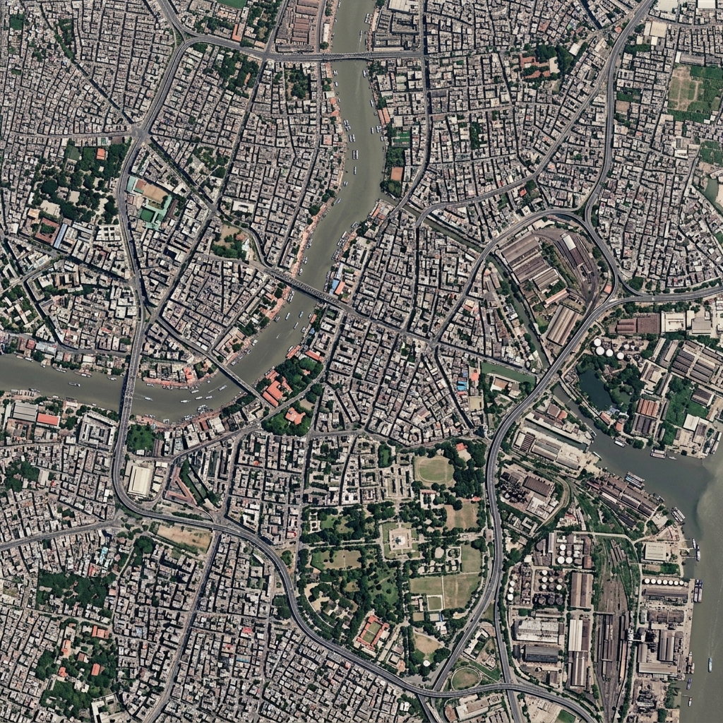
Every map starts from above. Satellite imagery gives you the raw material: terrain, elevation, rivers, coastlines, forests, residential blocks, industrial zones. This is the canvas on which everything else is drawn. Without accurate satellite data, you are guessing at the physical shape of the world.
The quality of this foundational layer determines the quality of everything that follows. This is not a step you can shortcut; it is the bedrock of the entire system.
Roads are the skeleton of any navigation-grade map. But identifying them is a two-part problem that neither satellite nor ground data can solve alone.
The satellite gives you a good look at things from the sky, while the ground data is necessary to figure out all the stuff that is hidden from that angle... lanes, service roads, internal campus routes, narrow by-lanes. A comprehensive road network requires both sources working in combination.

Actually, I realise this is a tangent, but it is worth noting before we move on.
Knowing where a road is is not enough. Knowing precisely where a restaurant, hospital, petrol station, or apartment block sits... down to latitude and longitude... is a complete different problem.
This step is what separates genuinely useful maps from technically complete ones. The real world changes constantly: businesses open and close, buildings go up, and sometimes addresses shift entirely because the local municipal corporation decided to rename the whole block without telling anyone. Keeping a Points of Interest database current at scale requires continuous data collection, verification, and update cycles.
This is the primary reason Google Maps is difficult to compete with. Not the roads; Google has spent years and billions collecting, verifying, and updating POI data at global scale. The volume and accuracy of this layer is the actual competitive moat.
A static map tells you where things are. A useful map tells you how long it will take to get there, right now, given current conditions. This requires a fundamentally different data infrastructure.
Real-time data includes two things:
Traffic patterns... understanding flow rates at every road segment, every hour, to model accurate ETAs. This requires ongoing aggregation of movement data from millions of active users or connected devices.
Incident data... road closures, accidents, waterlogging, construction. Some of this comes from civic sources; much of it comes from user-reported events. The faster this data reaches the map, the more useful the map becomes in the moments that matter.
The final layer is what transforms a technically accurate map into a product people actually want to use. This is the metadata layer... preferences, filters, and contextual intelligence layered on top of everything beneath it.
Route preferences... fastest, toll-free, highway-avoiding, fuel-efficient. These require understanding not just the road network but the user's intent.
Contextual POI overlays... not just "restaurant" but "dine-in restaurant open now within 500 metres that has parking." Not just "petrol station" but "petrol station with a clean restroom." This is where the depth of the POI database from step three pays dividends.
This is the layer most visible to the end user; and the layer most easily dismissed as cosmetic. It is not cosmetic. It is the difference between a map that works and a map people return to.
None of these five steps is a product decision. Each is an infrastructure decision... sequential, cumulative, and expensive. You cannot skip step two and compensate in step four. The moat in maps is not any single layer; it is the years of compounding investment across all five.
This is why Ola, Genesys, and every other company announcing a maps product in the last 15 days will be asked the same question within 12 months: how accurate is the POI layer? How current is the road data? What is the ETA error margin in Tier-2 cities at peak hours?
The announcement is step zero. The five steps above are what determine whether the map survives contact with real users at real scale.